Atrium redesign
Together with four other students I worked for The Hague Municipality to redesign their main atrium. Our client was looking for different approaches for changing the Atrium into a more visitor-centered space, that feels more friendly and welcoming. The wish of the client was to make the space feel like the living room of the city. To accomplish this we had to propose a design that takes multiple aspects of the Atrium into account.
Project Type:Spatial Design
Client: The Municipality of The Hague
Project Duration: February - May 2019
Deliverables: Research Report, Design Report, Presentation, Final design
Understanding the context
After an initial client meeting and getting the design brief we started out by creating mind-maps with the team to create an overview of all the aspects of the atrium and its visitors. This led to a better understanding of what to focus on during our research.
For our research we used a combination of methods to gather a variety of data. We observed the visitors during their visit to the atrium and conducted interviews with them. Besides that we created a behavioural map to gain a pather understanding of the pathing and touchpoints of the users.
Processing research
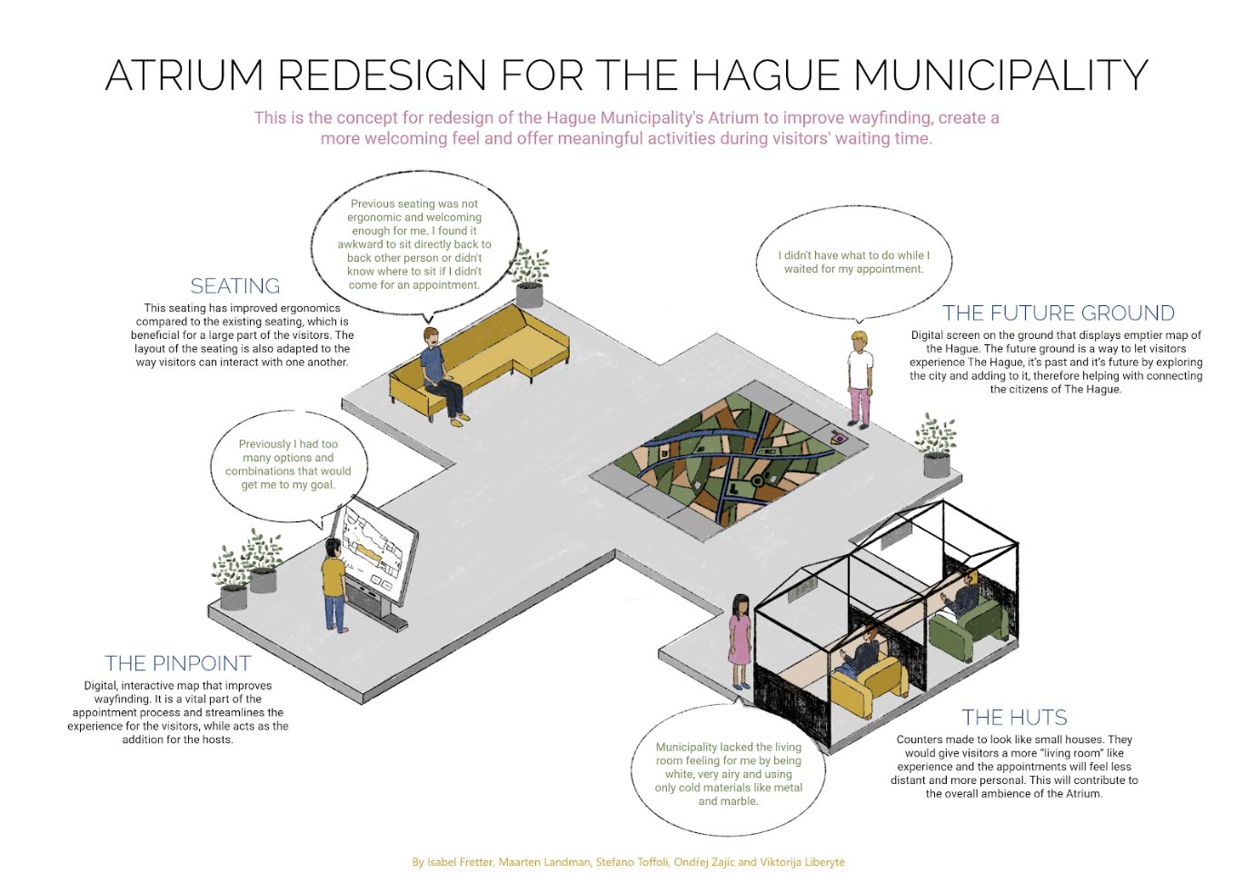
To gain a better understanding of the target group and define our research into data we made three personas to represent the three main groups of visitors. We also chose the 3 main design goals we would focus on:
- Engage people during the waiting time.
- Making the atrium feel more like a living room.
- Optimize the wayfinding.

From define to design
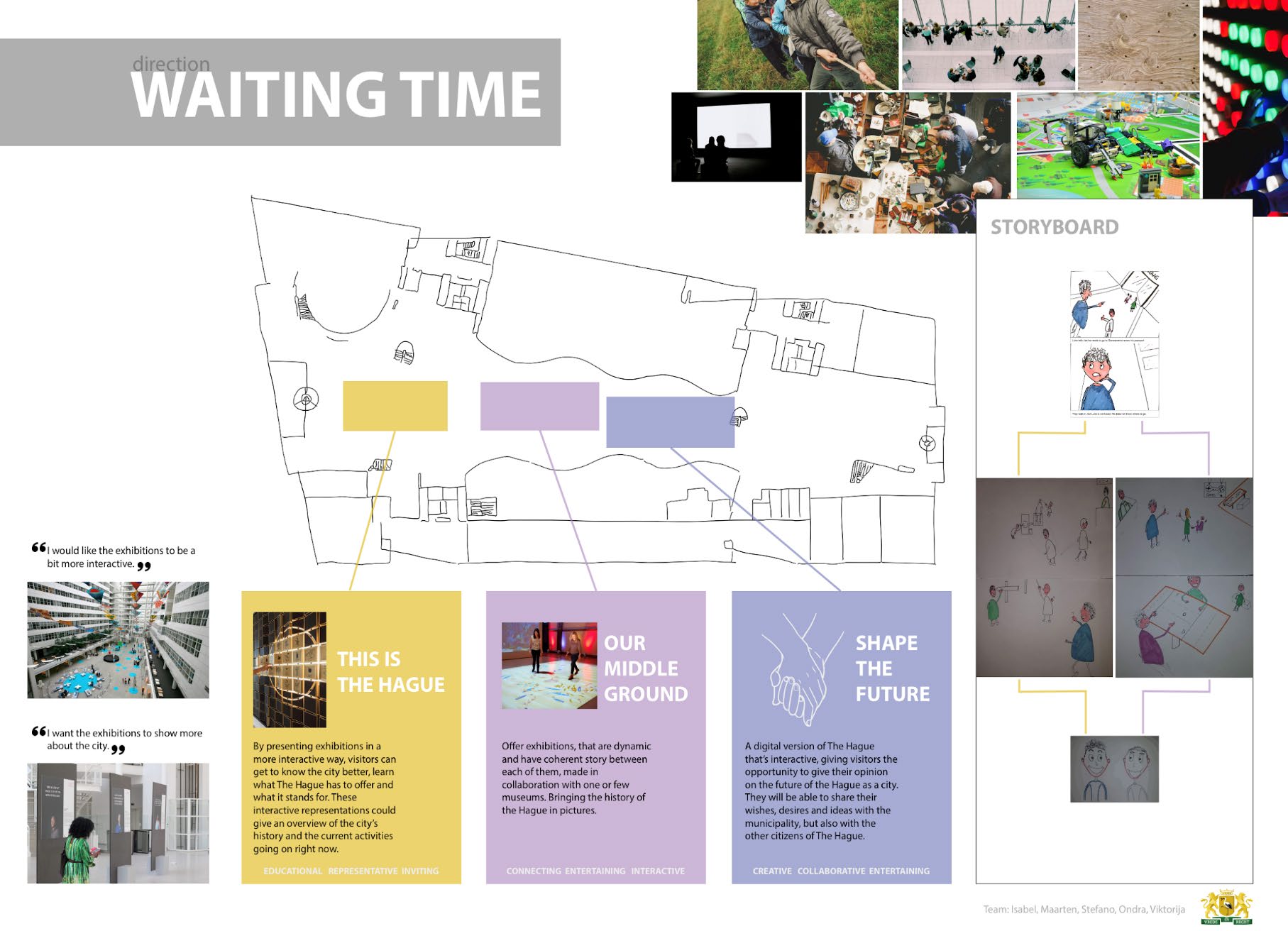
Concept creation was an individual process in order to not bias the mind and opinions of the other members and to be able to create and formulate as many different ideas as possible. Every single concept was presented and visualized through notes and post-its on the wall, with related feedback and ideas for improvement. Additionally, concepts have been grouped together by similarity, so the team was ready to discuss them.
Each design direction includes 3 different concepts, each of them belonging to the same category but offering a different solution. For each direction, the poster used for the client’s presentation and a more specific description of the concepts can be found below.
The first poster was created based on the direction ‘Wayfinding’ and the HMW question: HMW make the wayfinding more usable?

The second poster was created based on the direction ‘Livingroom’ and the HMW question: HMW make the seating area more like a living room?

The third poster was created based on the direction ‘Waiting time’ and the HMW question: HMW make the waiting time more engaging?
Final prototype
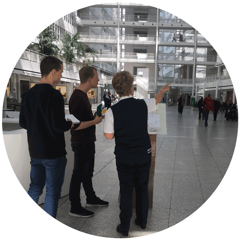
After the test in context, at The Hague municipality, the received feedback led to more adjustments to finalize the prototype. A possibility of scanning the QR code and being directed to the information verification screen as the first step of the process was added to the Pinpoint. Testing showed that not everything on the interface was self-explanatory. Therefore more text was added as well, to make the interface more explanatory, and a back arrow was added as well, since it was missing, together with the possibility to scan the QR code again. The test of the Future Ground showed that visitors were happy to see that they could give their opinion about the city while consequently feeling valued. On the other side, people would like to have more time to think about their ideas and not having to write them on the spot. Children were eager to draw something, which is a sign that it could also entertain children.